library(Stat2Data)
data("NFLStandings2016")3 Multiple Regression
The first multiple regression model introduced in Chapter 3 models the winning percentage of the 32 NFL teams during the 2016 regular season as a function of each teams total points scored on offense, and their total points allowed on defense.
These WinPct(the outcome variable), PointsFor, and PointsAgainst (the two explanatory variables) are found in the NFLStandings2016 data set, which comes with the Stat2Data R package:
Before introducing the regression model that uses all three variables, the authors explore bivariate relationships between different combinations these variables. To this end, the authors present a scatter plot matrix in Figure 3.1, which holds scatter plots based on each possible two-variable combination that could be made out of these three variables.
The easiest way to produce a scatter plot matrix for ourselves is to use the ggpairs() function from the GGally R package (Schloerke et al. 2021). By default, the ggpairs() function will build the scatter plot matrix using all the variables in the data set provided to it. Since we only wish to use three of the variables, we’ll use the select() function from the dplyr package to create a new data set holding just the WinPct, PointsFor, and PointsAgainst variables, and base our plot on this smaller data set:
library(dplyr)
library(GGally)

NFL_minimal <- NFLStandings2016 |>
  select(WinPct, PointsFor, PointsAgainst)

ggpairs(NFL_minimal)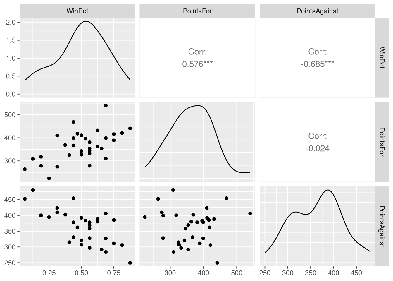
ggpairs() produces a scatter plot matrix with a few differences compared to the one in the book: it displays a density plot of each individual variable along the diagonal of the matrix (instead of the variable names), and prints the correlation coefficient in the upper triangle of the matrix (instead of the same scatter plots from the lower triangle with their axis transposed). The default ggpairs() scatter plot does display more information, but if you wish to exactly reproduce the Figure 3.1, you can customize what is displayed on the diagonal and upper triangle:
ggpairs(NFL_minimal,
        upper = list(continuous = "points"),
        diag = list("continuous" = function(data, mapping, ...)
                     {
                        ggally_text(rlang::as_label(mapping$x),
                                    size=10, col="black"
                                    )
                      }
                    )
          )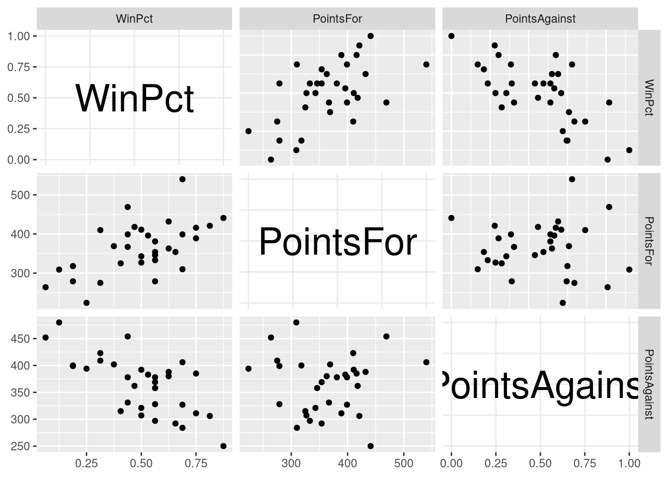
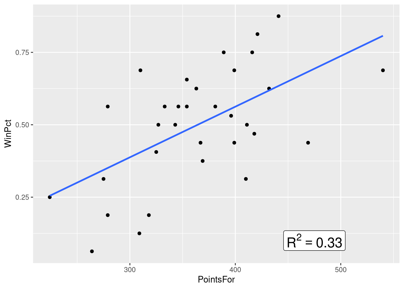
Figure 3.2 focuses in on the top-middle and top-right panel of the scatter plot matrix, which show the win percentage vs. points scored relationship, and the win percentage vs. points allowed relationships, respectively. This figure places the two scatter plots side-by-side, adds a visualization of the bivariate regression model to each panel, and annotates the plot with the value of the \(R^2\) statistic.
We learned in Chapter 1 how to add a visualization of the bivariate regression model to a scatter plot, but we’ve yet to learn 1) how to place two separate scatter plots side-by-side, and 2) how to annotate the plot with text.
Let’s learn how to annotate the plot with the \(R^2\) statistic first. Of course, before we annotate the plot with the \(R^2\) statistic, we’ve got to compute the \(R^2\) statistic! So, let’s fit the two bivariate models, and extract the \(R^2\) statistic from each one:
winPct_pointsFor_model <- lm(WinPct ~ PointsFor, data=NFLStandings2016)
winPct_pointsFor_R2 <- summary(winPct_pointsFor_model)$r.squared
winPct_pointsFor_R2
[1] 0.3323022winPct_pointsAgainst_model <- lm(WinPct ~ PointsAgainst, data=NFLStandings2016)
winPct_pointsAgainst_R2 <- summary(winPct_pointsAgainst_model)$r.squared
winPct_pointsAgainst_R2[1] 0.46863Next, we’ll annotate the WinPct vs. PointsFor scatter plot with the \(R^2\) statistic for that model, using the annotate() function from the ggplot2() package:
ggplot(data=NFLStandings2016, aes(x=PointsFor, y=WinPct)) +
  geom_point() +
  geom_smooth(method = lm, se=FALSE, formula = y~x) +
  annotate(geom="label", x = 475, y = .1,
           label = paste0("R^2==", round(winPct_pointsFor_R2, 2)),
           parse = TRUE, size=6
           )
In order to prepare for juxtaposing both annotated scatter plots, we’ll save this plot as a variable. Notice that when we do this, no plot is printed out!
panel_A <-
  ggplot(data=NFLStandings2016, aes(x=PointsFor, y=WinPct)) +
  geom_point() +
  geom_smooth(method = lm, se=FALSE, formula = y~x) +
  annotate(geom="label", x = 475, y = .1,
           label = paste0("R^2==", round(winPct_pointsFor_R2, 2)),
           parse = TRUE, size=6
           )
Next, we repeat this same basic process with the WinPct ~ PointsAgainst model and scatter plot, changing the variable names and x/y position values where appropriate:
panel_B <-
  ggplot(data=NFLStandings2016, aes(x=PointsAgainst, y=WinPct)) +
  geom_point() +
  geom_smooth(method = lm, se=FALSE, formula = y~x) +
  annotate(geom="label", x = 425, y = .85,
           label = paste0("R^2==", round(winPct_pointsAgainst_R2, 2)),
           parse = TRUE, size=6
           )
Finally, we’ll take advantage of the grid.arrange() function from the gridExtra package to place the two plots side-by-side:
library(gridExtra)

grid.arrange(panel_A, panel_B, ncol = 2)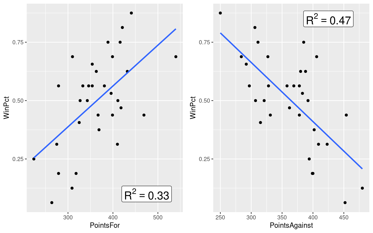
3.1 Multiple Linear Regression Model
Section 3.1, Example 3.2 introduces the book’s first multiple regression model, using both the PointsFor and PointsAgainst variables to predict the WinPct value for each team. We can reproduce the regression table and model equation shown in this example using some familiar tools: the lm() function, the extract_eq() function, and the summary() function
The only place where we’ll notice a change in our code when we move from a “simple” linear model with one explanatory variable to a multiple regression with two explanatory variables is with our model formula inside the lm() function
winPct_multiple_reg <- lm(WinPct ~ PointsFor + PointsAgainst, data = NFLStandings2016)To add a second explanatory variable to the model, you literally add another explanatory variable to the model formula using the + sign, and that’s all there is to it! Once the model is fit, you can work with it in R just like it was a “simple” linear regression model:
summary(winPct_multiple_reg)
Call:
lm(formula = WinPct ~ PointsFor + PointsAgainst, data = NFLStandings2016)

Residuals:
      Min        1Q    Median        3Q       Max
-0.149898 -0.073482 -0.006821  0.072569  0.213189

Coefficients:
                Estimate Std. Error t value Pr(>|t|)
(Intercept)    0.7853698  0.1537422   5.108 1.88e-05 ***
PointsFor      0.0016992  0.0002628   6.466 4.48e-07 ***
PointsAgainst -0.0024816  0.0003204  -7.744 1.54e-08 ***
---
Signif. codes:  0 '***' 0.001 '**' 0.01 '*' 0.05 '.' 0.1 ' ' 1

Residual standard error: 0.09653 on 29 degrees of freedom
Multiple R-squared:  0.7824,    Adjusted R-squared:  0.7674
F-statistic: 52.13 on 2 and 29 DF, p-value: 2.495e-10library(equatiomatic)
extract_eq(winPct_multiple_reg, use_coefs=TRUE, coef_digits = 4)\[ \operatorname{\widehat{WinPct}} = 0.7854 + 0.0017(\operatorname{PointsFor}) - 0.0025(\operatorname{PointsAgainst}) \]
One thing we did have to do differently here was include the coef_digits argument fo the extract_eq() function. Because a single point has such a small effect on the win percentage for an entire season, the coefficients of this model as quite small values. Without setting the coef_digits argument` to a larger number, the equation would just show the coefficients rounded down to 0!
3.1.1 Visualizing a Multiple Regression Model
One thing suspiciously absent from Section 3.1 is a visualization of the WinPct ~ PointsFor + PointsAgainst. Visualization of a model’s predictions can be a great aid in understanding the model’s structure, so why is such a figure absent?
The answer likely lies in the fact that visualizing a multiple regression model with two numeric explanatory variables requires a 3D plot instead of a 2D plot. Indeed, we need a third dimension to measure our third numeric variable along! So, this visualization omission can be forgiven if we are willing to admit that 3D plots in a 2D book are well, a bit tricky.
Even though 3 dimensions are more complex than 2, it’s still not too hard to lean how to do in R. One of easier ways to construct 3D plots showing the predictions of a multiple with two numeric explanatory variables, along with the data the model was fit to, is with the regplanely package (the reason for the “plane” in the name will become clear soon!).
Because the regplanely package is an “unofficial” R package (i.e., it’s not included in the Comprehensive R Archive Network that you normally install packages from), we’ll have to install it a different way. First, install the remotes package by running this command in your R console:
install.packages("remotes")Next, use the install_github function to install the regplanely package straight from the location of it’s source code archive, on github.
remotes::install_github("wjhopper/regplanely")With the regplanely package installed, we can finally put it to use! The regression_plane() function takes a fitted regression model object, and uses it to draw the predictions of the regression model as a plane in 3D space.
library(regplanely)

winPct_multiple_reg <- lm(WinPct ~ PointsFor + PointsAgainst, data = NFLStandings2016)
regression_plane(winPct_multiple_reg)
Since the regression_plane() function builds it’s visualizations with plotly instead of ggplot2, you can interact with these plots (e.g., zoom, rotate, etc.) in RStudio or a web browser.
3.2 Assessing a Multiple Regression Model
Section 3.2 is more focused on inferential statistics in the context of multiple regression, but as we know, it’s unwise to focus on inferential statistics without first examining the pre-conditions (the linearity, equal variance, and Normality assumptions).
Fortunately, it’s just as easy to examine these assumptions for a multiple regression model with several numeric explanatory variables as it is for a ‘simple’ linear regression model. We can use the exact same tools from the performance() package we used back in Chapter 1.
In example with the Honda Accord prices, we examined the linearity, equal variance, and Normality assumption with three separate plots (two Fitted vs. Residuals plots, and one Normal Quantile plot). Since we’re more familiar with each individual plot, now, let’s save a bit of time and ask the performance() package to display them all each of them within a single visualization:
library(performance)

winPct_multiple_reg <- lm(WinPct ~ PointsFor + PointsAgainst, data = NFLStandings2016)
check_model(winPct_multiple_reg,
            check = c("linearity", "homogeneity", "qq", "normality")
            )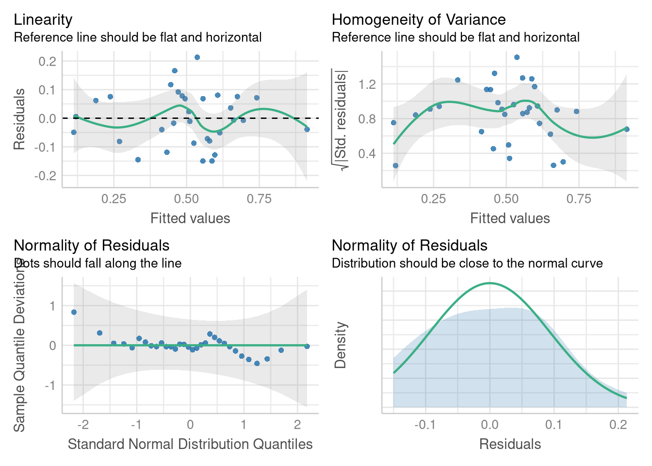
The plots in the bottom row (the Normal quantile plot, and the Normal density plot) are two ways of assessing the same thing (the assumption that the residuals are Normally distributed). But, the Normal density plot complements the Normal quantile plot for a reader who might not be comfortable with a QQ plot (and who wants to leave 1/4 of their plot blank?).
3.2.1 t-Tests for Coefficients
The t-tests (and the associated p-values) for each coefficient are in the
winPct_multiple_reg <- lm(WinPct ~ PointsFor + PointsAgainst, data = NFLStandings2016)
summary(winPct_multiple_reg)
Call:
lm(formula = WinPct ~ PointsFor + PointsAgainst, data = NFLStandings2016)

Residuals:
      Min        1Q    Median        3Q       Max
-0.149898 -0.073482 -0.006821  0.072569  0.213189

Coefficients:
                Estimate Std. Error t value Pr(>|t|)
(Intercept)    0.7853698  0.1537422   5.108 1.88e-05 ***
PointsFor      0.0016992  0.0002628   6.466 4.48e-07 ***
PointsAgainst -0.0024816  0.0003204  -7.744 1.54e-08 ***
---
Signif. codes:  0 '***' 0.001 '**' 0.01 '*' 0.05 '.' 0.1 ' ' 1

Residual standard error: 0.09653 on 29 degrees of freedom
Multiple R-squared:  0.7824,    Adjusted R-squared:  0.7674
F-statistic: 52.13 on 2 and 29 DF,  p-value: 2.495e-10
3.2.2 Confidence Intervals for Coefficients
Confidence intervals around the coefficients of a multiple linear regression model have the same mathematical form as for confidence intervals around the coefficients of a “simple” linear regression model. And, we can still use the tidy() function from the broom package to obtain a regression table supplemented with confidence intervals for each coefficient:
library(broom)

tidy(winPct_multiple_reg, conf.int = TRUE)
Notice that the bounds for the coefficient of the PointsFor variable (shown in the conf.low and conf.high columns) match the bounds shown in Example 3.5
3.2.3 ANOVA for Multiple Regression
The ANOVA tables shown in Chapter 3 display 3 rows:
- The degrees of freedom, sum of squares, mean square and F-statistic for the “Model” or “Regression” source of variance
- The degrees of freedom, sum of squares, and mean square for the “Error” source of variance
- The total degrees of freedom, sum of squares, and mean square for both the outcome variable
However, R’s anova() function produces a slightly different ANOVA table, as shown below:
winPct_multiple_reg <- lm(WinPct ~ PointsFor + PointsAgainst, data = NFLStandings2016)
anova(winPct_multiple_reg)
The most important different is that R does not report a single row for the “Model” source of variance; instead, R reports the degrees of freedom, sum of squares, mean square and F-statistic for each explanatory variable in the model.
Each row in the table before the “Residuals” row summarizes the variance in the outcome explained by each explanatory variable, after each previously summarized explanatory variable is taken into account. For example, the 0.55884 value for the sums of squares associated with the PointsAgainst variable represents the additional variability in team win percentage after the PointsFor variable is taken into account.
Notice that the “Regression” row in the ANOVA table shown in Example 3.6 can be recovered by summing the PointsFor and PointsAgainst rows of R’s ANOVA table:
anova(winPct_multiple_reg) |>
  as_tibble() |>
  slice(1:2) |> # keeps just the first two rows of the table
  summarize(Df = sum(Df),
            `Sum Sq` = sum(`Sum Sq`),
            ) |>
  mutate(`Mean Sq` = `Sum Sq`/Df)
3.2.4 Coefficient of Multiple Determination
The adjusted \(R^2\) statistic is introduced in Section 3.2. The adjusted \(R^2\) statistic is a penalized version of the “plain” \(R^2\) statistic, with the penalty growing with the number explanatory variables in the model.
There’s no need for you to implement the rather tricky computation for the adjusted \(R^2\) statistic: just like its “plain” counterpart, the adjusted \(R^2\) statistic can be found in the output from the summary() function, beneath the table of regression coefficients:
summary(winPct_multiple_reg)
Call:
lm(formula = WinPct ~ PointsFor + PointsAgainst, data = NFLStandings2016)

Residuals:
      Min        1Q    Median        3Q       Max
-0.149898 -0.073482 -0.006821  0.072569  0.213189

Coefficients:
                Estimate Std. Error t value Pr(>|t|)
(Intercept)    0.7853698  0.1537422   5.108 1.88e-05 ***
PointsFor      0.0016992  0.0002628   6.466 4.48e-07 ***
PointsAgainst -0.0024816  0.0003204  -7.744 1.54e-08 ***
---
Signif. codes:  0 '***' 0.001 '**' 0.01 '*' 0.05 '.' 0.1 ' ' 1

Residual standard error: 0.09653 on 29 degrees of freedom
Multiple R-squared:  0.7824,  Adjusted R-squared:  0.7674
F-statistic: 52.13 on 2 and 29 DF,  p-value: 2.495e-10
3.2.5 Confidence and Prediction Intervals
The easiest way to compute confidence and prediction intervals around our model’s predicted outcome is to hand our fitted model object off to the predict() function. For example:
predict(winPct_multiple_reg, interval = "confidence") fit lwr upr
1 0.9143024 0.82272694 1.0058778
2 0.7413510 0.68174866 0.8009534
3 0.6745702 0.62362296 0.7255175
4 0.5368107 0.49004268 0.5835788
5 0.6953926 0.59054904 0.8002362
6 0.6073397 0.53716546 0.6775139
7 0.6518565 0.60556587 0.6981472
8 0.6622498 0.60297051 0.7215291
9 0.5565525 0.50359855 0.6095063
10 0.4591635 0.42279419 0.4955328
[ reached 'max' / getOption("max.print") -- omitted 22 rows ]returns the conditional mean win percentage, upper confidence interval bound on the mean win percentage, and lower confidence interval bound on the mean win percentage for each observation in the NFLStandings2016 data set.
And we can still generate the confidence interval boundaries on the mean win percentage for arbitrary values of our explanatory variables by supplying a new data frame of “observed” values to the precict() function. But, constructing this new data frame of values can be a bit more involved when dealing with a multiple regression model: now, we need to create a data frame with multiple columns in it, because our model uses combination of explanatory variables to generate it’s predictions.
One function that is quite useful in this context is the expand.grid() function1. You supply the expand.grid() function one or more vector of values, and it constructs a data frame whose rows hold all possible combinations of the values from that variable. This is quite useful for generating a grid of values at which to evaluate the predictions of your multiple regression model!
For example, consider the example below, which constructs a data frame whose 9 rows hold all 9 possible combinations of 200, 300, and 400 points allowed, and 200, 300, and 400 points scored:
points_grid <- expand.grid(PointsFor = c(200, 300, 400),
                           PointsAgainst = c(200, 300, 400)
                           )
points_grid
We can pass this grid of combinations to the predict() function to find the 99% prediction interval at each location:
predict(winPct_multiple_reg, newdata = points_grid,
        interval = "prediction", level = .99
        )
fit lwr upr
1 0.6288852 0.29856134 0.9592091
2 0.7988006 0.48799331 1.1096078
3 0.9687159 0.66117342 1.2762584
4 0.3807276 0.07947089 0.6819843
5 0.5506429 0.27037295 0.8309129
6 0.7205583 0.44335641 0.9977601
7 0.1325700 -0.16407923 0.4292192
8 0.3024853 0.02661435 0.5783563
9 0.4724006 0.19908257 0.7457187At the time of writing2, there is straightforward way to visualize the confidence interval or prediction interval around the model using the regression_plane() function from the regplanely package. So for the time being, your confidence intervals around the conditional means will have to live in a table, rather that in a visualization.
3.3 Comparing Two Regression Lines
The inauspicious name of Section 3.3 hides an important development: using a categorical variable as an explanatory variable in a regression model! This section introduces the reader to models with one numeric and one categorical explanatory variable. As the author’s point out, this development will allow us compare linear relationships across the groups determined by this categorical explanatory variable, and test whether aspects of the model (such as the slope, the intercept, or possibly both) differ reliably between groups.
Example 3.9 uses the ButterfliesBc data set in order to introduce a parallel slopes regression model. This data set measures average wing length for male and female Boloria chariclea butterflies in Greenland, along with the average summer temperatures the butterflies were exposed to, for each year from 1996 through 2013.
library(Stat2Data)
data("ButterfliesBc")
Figure 3.5 displays a scatter plot showing the relationship between the average wing length of the sampled butterflies, and the prior summer’s average temperature, with the “points” in the plot color-coded by the sex of the butterfly. Instead of providing a legend to map these colors back to the sex of the butterfly, the authors use the letters “m” and “f” as the “points” in this scatter plot. While this is a bit too clever (a legend is optimal), it’s worth recreating this figure because it teaches us a bit about ggplot:
First, need a column in the data set that holds an “m” or an “f” in each row, depending on the sex of the butterfly
ButterfliesBc <- ButterfliesBc |>
  mutate(Sex2 = recode(Sex, Male = "m", Female = "f"))
Then, we’ll map this new Sex2 variable to the label aesthetic of the plot, which will enable us to draw each observation on the plot using geom_text() (instead of geom_point()):
ggplot(
  data = ButterfliesBc,
  mapping = aes(x = Temp, y = Wing, color = Sex, label = Sex2)
) +
  geom_text() +
  guides(label = "none", color = "none")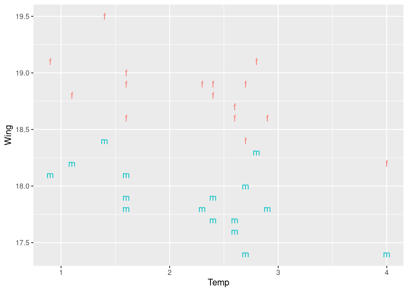
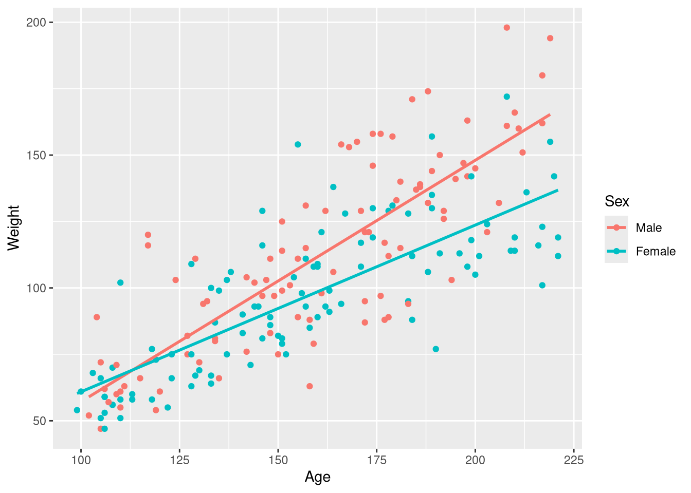
Figure 3.6 shows the same scatter plot, but with the predictions of the fitted parallel slopes model drawn on top of the observations. One method for reproducing Figure 3.6 would be manually computing the predicted Wing lengths for a large number of closely-spaced temperature values (much like we did in Chapter 2, when constructing the bounds of the 95% prediction interval), and adding them to the plot with geom_line(). Luckily, there is an easier method: using the ggeffects package (Lüdecke 2018).
To recreate Figure 3.6 with the ggeffects package (without the cute “m” and “f” for male and female, sadly), we can follow a 3 step process
- Fit the parallel slopes model using
lm() - Compute its predictions using
predict_response()- In this step, we’ll need to provide a character vector to the
termsargument to specify which explanatory variables should be used while computing the predictions.
- In this step, we’ll need to provide a character vector to the
plot()the resulting predictions
# Step 1
wing_by_sex_model <- lm(Wing ~ Temp + Sex, data = ButterfliesBc)

# Step 2
library(ggeffects)
predict_response(wing_by_sex_model, terms = c("Temp", "Sex")) |>
  plot(show_data = TRUE) # Step 3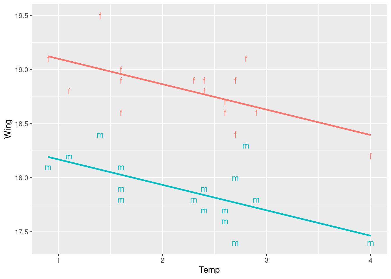
The predict_response() function may warn you about using character variables in your model, and recommend you convert these variables into factor objects before fitting the model. In general, this warning is a bit overly cautious, and can be safely ignored in nearly all cases.
Likewise, the plot() function may encourage you to “jitter” the points to avoid having overlapping points in the plot. This is a very mild recommendation, and is entirely optional; you should decide based on how sensible the plot appears to you.
Fitting the parallel slopes model
As we just saw above in Step 1 of plotting, you can fit a parallel slopes model in the same fashion as any other multiple linear regression model: with the lm() function! To fit a regression model that allows the Wing vs. Temp regression line for male and female butteries to differ only by their intercept values, simply include + Sex on the right-hand side of your model formula
wing_by_sex_model <- lm(Wing ~ Temp + Sex, data = ButterfliesBc)
summary(wing_by_sex_model)
Call:
lm(formula = Wing ~ Temp + Sex, data = ButterfliesBc)

Residuals:
     Min       1Q   Median       3Q      Max
-0.36961 -0.13114 -0.03910  0.08433  0.55390

Coefficients:
            Estimate Std. Error t value Pr(>|t|)
(Intercept) 19.33547    0.13372  144.60  < 2e-16 ***
Temp        -0.23504    0.05391   -4.36  0.00015 ***
SexMale     -0.93125    0.08356  -11.14 5.35e-12 ***
---
Signif. codes:  0 '***' 0.001 '**' 0.01 '*' 0.05 '.' 0.1 ' ' 1

Residual standard error: 0.2364 on 29 degrees of freedom
Multiple R-squared:  0.8316,    Adjusted R-squared:   0.82
F-statistic:  71.6 on 2 and 29 DF,  p-value: 6.059e-12
The intercept, slope, and “intercept offset” coefficients in this regression table have identical values to those from the regression table shown beneath the “Assess” heading in Example 3.9 (whew!), but the term labels differ. In the STAT2 textbook, the change in the intercept is labeled IMale, while R does not use any notation to indicate the explanatory variable is an indicator, and labels the term SexMale. R will always use the naming convention {NameOfVariable}{NameOfGroup} when labeling coefficients that reflect a categorical effect.
The fitted model equation extracted by the extract_eq() function also follows this notation, naming the explanatory variable \(\operatorname{Sex}\), and indicating this term applies to the “Male” sex group specifically by including \({}_{Male}\) in the subscript.
library(equatiomatic)
extract_eq(wing_by_sex_model, use_coefs = TRUE)
\[ \operatorname{\widehat{Wing}} = 19.34 - 0.24(\operatorname{Temp}) - 0.93(\operatorname{Sex}_{\operatorname{Male}}) \]
If you wish to change this notation, you can always use the extract_eq() function in the R console, copy the raw \(\LaTeX\) markup it produces, and edit it as you see fit. For example, the call to extract_eq() above produces the raw \(\LaTeX\) markup:
$$
\operatorname{\widehat{Wing}} = 19.34 - 0.24(\operatorname{Temp}) - 0.93(\operatorname{Sex}_{\operatorname{Male}})
$$
We could edit the 0.93\operatorname{Sex}_{\operatorname{Male}} portion to be 0.93 \cdot 1_{\operatorname{Male}}(\operatorname{Sex}) instead, which produces the equation:
\[ \operatorname{\widehat{Wing}} = 19.34 - 0.24(\operatorname{Temp}) - 0.93 \cdot 1_{\operatorname{Male}}(\operatorname{Sex}) \]
which allows the reader to easily identify the final term as an indicator variable
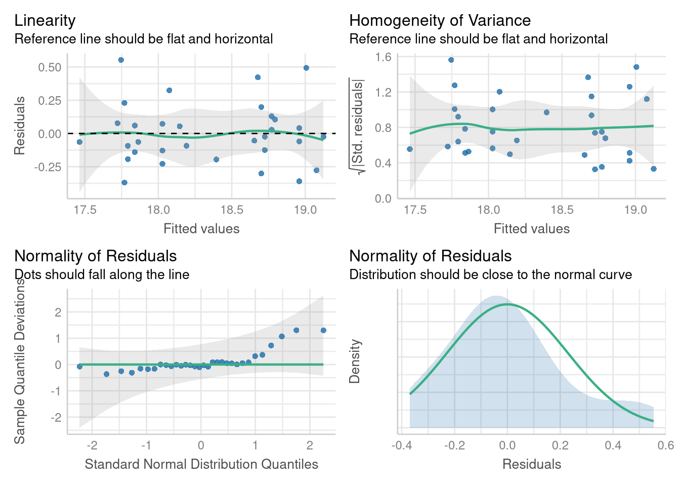
Assessing the parallel slopes model
Luckily, checking the Linearity, Normality, and Equal Variance assumptions by creating Fitted vs. Residuals plots and Normal quantile plots proceeds in familiar fashion, with no deviation from how we’ve previous used the performance package. For example, we can reproduce Figure 3.7 using the check_model() function (though the plots are displayed in a different order):
library(performance)

check_model(wing_by_sex_model,
            check = c("qq", "normality", "linearity", "homogeneity")
            )
3.3.1 Removing the Parallel Slopes constraint
Example 3.10 presents a situation where, unlike the Male and Female butterflies, the simplifying assumption that both groups of observations share the same slope would be misleading. The Kids198 data set holds age (measured in months) and weight measurements of from a sample of 198 children:
library(Stat2Data)
data("Kids198")
Both male and female children are measured in this sample (or, boys and girls I suppose), and Figure 3.10 shows that males tend to gain more weight for each month older they get compared to females. In other words: the slope of the Age vs. Weight regression line is steeper for males as compared to females. A first attempt at reproducing Figure 3.10 using ggplot does not go quite as planned:
ggplot(data = Kids198,
       mapping = aes(x = Age, y = Weight, color = Sex)
       ) +
  geom_point() +
  geom_smooth(method = lm, se = FALSE, formula = y~x)
Warning: The following aesthetics were dropped during statistical transformation:
colour.
ℹ This can happen when ggplot fails to infer the correct grouping structure in
the data.
ℹ Did you forget to specify a `group` aesthetic or to convert a numerical
variable into a factor?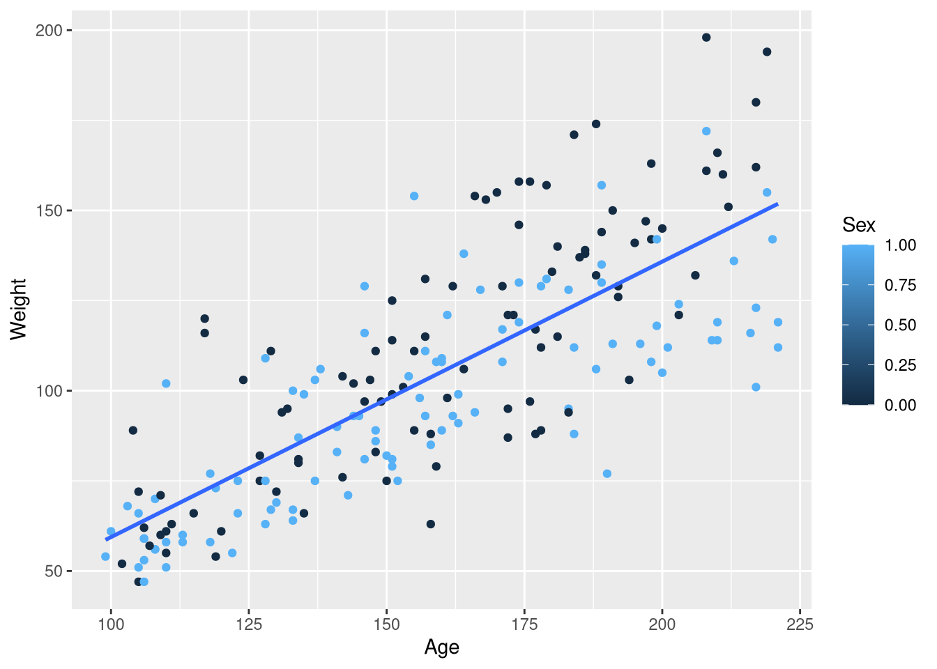
In the previous example with male and female butterflies, mapping the Sex variable to the color aesthetic resulted in points that were color-coded by Sex, with one distinct color representing males and another distinct color for females. And, we obtained separate regression lines for male butterflies and female butterflies. But now, we we have males and females represented as two ends of a blue-ish color spectrum and only one regression line. What gives?
The issue that in the previous butterflies example, the Sex column held the words "Male" and "Female"; R treats variables holding character data as inherently categorical. But in the Kids198 data set, the Sex column holds 0’s and 1’s as “abbreviations” for male and female, respectively. R treats these 0’s and 1’s as quantities instead of categories, so we’ll need to make some adjustments to obtain the plot we want.
There are several ways to get the job done, but perhaps the most straightforward is to use the recode() and mutate() functions from the dplyr package to change each 0 in the Sex variable to the word "Male“, and every 1 to the word "Female":
Kids198 <- Kids198 |>
  mutate(Sex = factor(Sex, labels = c("Male", "Female")))
select(Kids198, Weight, Age, Sex)
With the Sex variable re-coded to clearly represent categories instead of numbers, the same ggplot() code produces the plot we’re after:
ggplot(data = Kids198,
       mapping = aes(x = Age, y = Weight, color = Sex)
       ) +
  geom_point() +
  geom_smooth(method = lm, se = FALSE, formula = y~x)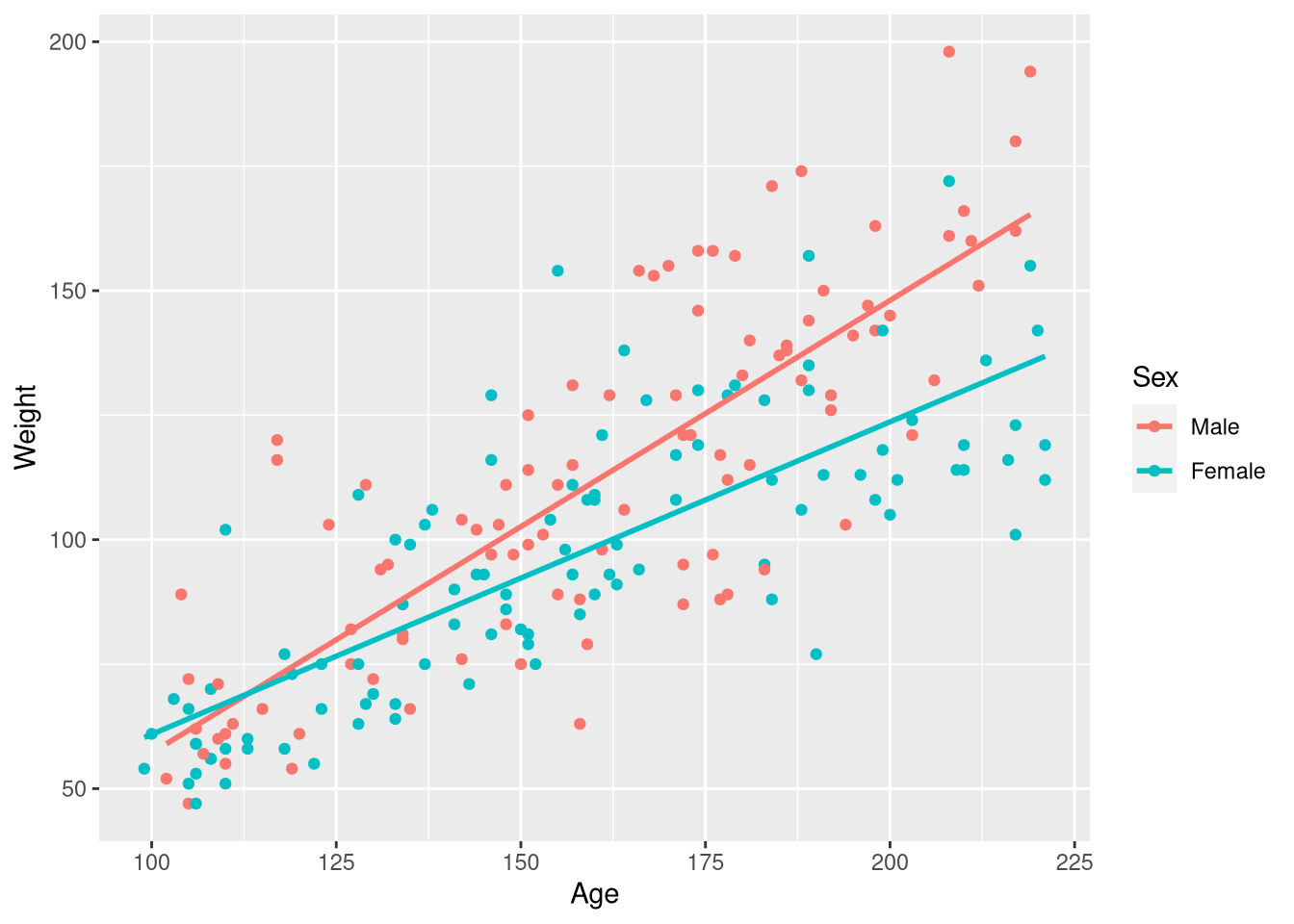
Since we do want to estimate a separate slope of the regression line for males and females, we can return to using the familiar geom_smooth() function to draw the regression lines on top of the observations.
We can also fit this model using lm(), but obtaining a model that allows the effect of age to vary across the sexes requires a small change to our model formula notation. Instead of combining the effects of our two explanatory variables, Age and Sex, with a + sign operator, we combine them using the * multiplication operator:
weight_age_model <- lm(Weight ~ Age * Sex, data = Kids198)The reason we swapped our + sign for a multiplication operator is revealed by looking at the fitted model equation:
extract_eq(weight_age_model, use_coefs = FALSE)\[ \operatorname{Weight} = \alpha + \beta_{1}(\operatorname{Age}) + \beta_{2}(\operatorname{Sex}_{\operatorname{Female}}) + \beta_{3}(\operatorname{Age} \times \operatorname{Sex}_{\operatorname{Female}}) + \epsilon \]
Notice that in the final term of the equation, the Age variable is multiplied by the Sex variable!3 This multiplicative term is what allows for a different slope between the regression line for male and female children, and this is why R’s model formula adopts the convention to use * when you to estimate a different slope for each group.
Reading the regression table can be a bit tricky for these models, but a little “algorithmic thinking” helps. Take a look at the regression table for the regression table for the Weight ~ Age * Sex below (displaying just the term labels and coefficient estimates):
If you look in the (small) figure to the right that visualizes the model, we can see that to fully describe both lines (i.e., both models) we need two intercepts, and two slopes (one for each line!). So, the question becomes: where can we find those pieces of information in the regression table?
The (Intercept) term (-1.84) represents the y-axis intercept for the baseline group’s regression line. In this case, the baseline group are the male children. By default, R will put the groups into alphanumeric order, and choose the first group in that list to serve as the baseline group. Knowing this, it’s bit confusing as to why “Female” isn’t the baseline group (since “F” comes before “M”). This is because we used the factor() function to make categories out of the 0’s and 1’s in the original Sex variable, males were coded as 0’s, and this males were “first” and become the baseline group. Even if we didn’t know this, we can also determine “Male” is the baseline group because it’s the only category from the Sex variable not mentioned in any of the term labels
The coefficient for the Age variable (.627) represents the slope for the baseline group (male children). How are we supposed to know it’s the baseline group’s slope? In this model, each group gets it’s own slope. In other words, the slope of the regression line depends on the group. So, to know what the slope is, you have to know the group. Since the term doesn’t mention a group, you know it must apply to the baseline group.
The final two coefficients are a bit different than the first two: these coefficients represent differences between the intercept and slope of the regression lines for the male and female groups
The SexFemale coefficient (-31.9) represents the difference in the intercept between the male and female regression lines. Since this coefficient is labeled with the Female category name, we know the intercept for the female regression line is 31.9 pounds above the intercept for the male regression line. How do we know it is the difference in the intercept, and not the difference in the slope? In this model, the “slope” comes from the gradual change in weight that is produced by a gradual change in age. And, the Age variable is not mentioned any where in this term label; so, we know this term can’t be interpreted as anything slope-related, because it doesn’t involve the Age variable!
Finally, the coefficient for the Age:SexFemale term (-0.281) represents the difference in the slope between the male and female regression lines. We can infer this because the term label mentions both explanatory variables: the presence of SexFemale in the label tells us we are contrasting the female group with the baseline group (males), and the presence of Age in the label tells us we are measuring the effect of Age on our outcome (weight). The difference in the effect of Age on Weight between the male and female groups is exactly what we mean by “change in slope”!
We began our reading of the regression table asking the question: where in the regression table can we find the two intercepts and the two slopes that we need to fully describe his model? We found the intercept and the slope for the baseline group (male children) in the rows labeled (Intercept) and Age. And, there was a bit of a plot twist for the intercept and slope for the female children’s regression line; the regression table doesn’t actually hold the intercept and slope for the female children’s regression line, but instead tells you how the intercept and slope differ from the male children’s regression line.
Warning
Based on this example, it might be tempting to conclude “the intercept and slope for the baseline group are in the first two rows, the difference in intercept is in row three, and the difference in slope is in row four”. But, consider what happens when the order of the explanatory variables is reversed in the model formula:
weight_age_model_v2 <- lm(Weight ~ Sex * Age, data = Kids198)
tidy(weight_age_model_v2)
The values in the estimate column are the same, but their order has changed: Now, the slope for the males group is in row three, and the difference in intercept between the groups is in row two. This means that the order of the coefficients depends on the order of the variables in the formula! So, always be sure to use the term labels, your knowledge of the variables types, and your knowledge of the category levels to guide your interpretations. Never rely on the order heuristic!
3.4 New Predictors from Old
Section 3.4 extends the idea of allowing your regression to model a change in the relationship between two numeric variables (i.e., a change in slope) across distinct categories of observations into the domain of allowing your regression to model a smooth, gradual changing in the relationship between two numeric variables as yet another numeric explanatory variable also changes. Just as in the case of the interaction between categorical and numeric explanatory variables in section 3.3, the interaction effect between numeric variables is made possible by introducing an explanatory variable that is a product of two explanatory variables in the model.
Example 3.11 introduces a regression model with two numeric explanatory variables, as well as an interaction term based on those two numeric explanatory variables. This example uses the Perch data set, which holds measurements of the weight (in grams), length (in centimeters), and width (in centimeters) for each of 56 Perch caught at Lake Laengelmavesi in Finland.
library(Stat2Data)
data("Perch")
We can fit a multiple regression model that includes an interaction between two numeric variables in the same fashion that we first a the multiple regression model that included an interaction between Sex and Age in Section 3.3: by combining the two variables in our model formula using the * multiplication operator:
perch_weight_model <- lm(Weight ~ Length * Width, data = Perch)
summary(perch_weight_model)
Call:
lm(formula = Weight ~ Length * Width, data = Perch)

Residuals:
     Min       1Q   Median       3Q      Max
-140.106  -12.226    1.230    8.489  181.408

Coefficients:
             Estimate Std. Error t value Pr(>|t|)
(Intercept)  113.9349    58.7844   1.938    0.058 .
Length        -3.4827     3.1521  -1.105    0.274
Width        -94.6309    22.2954  -4.244 9.06e-05 ***
Length:Width   5.2412     0.4131  12.687  < 2e-16 ***
---
Signif. codes:  0 '***' 0.001 '**' 0.01 '*' 0.05 '.' 0.1 ' ' 1

Residual standard error: 44.24 on 52 degrees of freedom
Multiple R-squared:  0.9847,    Adjusted R-squared:  0.9838
F-statistic:  1115 on 3 and 52 DF,  p-value: < 2.2e-16
The author’s also show a model based just on the \(\operatorname{Length} \times \operatorname{Width}\) product term, without the individual variables that go into the product. Don’t ever do this yourself, but for completeness, here’s how you would execute this bad idea in R:
perch_missing_terms_model <- lm(Weight ~ Length:Width, data = Perch)
coef(perch_missing_terms_model)
(Intercept) Length:Width
-136.926224 3.319287 3.4.1 Interpreting the coefficients of a two-way numeric interaction model
The author’s treat the Weight ~ Length * Width model of the Perch fish weights mostly as a “modeling for prediction” exercise, noting the high \(R^2\) statistic this model achieves. But, they don’t offer much advice about how you should think about the meaning of the model’s three coefficients.
tidy(perch_weight_model)- The
(Intercept)term (113.93) is the “z-axis” intercept: it represents the predicted fish weight when the Fish has 0 width and 0 length (a bit of an overestimate if you ask me!) - The coefficient for the
Lengthvariable (-3.48) represents the change in weight for each additional centimeter of width **when the fish has a length of 0” - The coefficient for the
Widthvariable (-94.63) represents the change in weight for each additional centimeter of length **when the fish has a width of 0” - The coefficient for the
Length:Widthvariable (i.e., the \(\operatorname{Length} \times \operatorname{Width}\) product) can be interpreted in two ways, both equally valid:- The change in the slope of the Weight vs. Width relationship, each time the Length variable increases by 1 cm.
- The change in the slope of the Weight vs. Length relationship, each time the Width variable increases by 1 cm.
Visualizing the model may help you believe some of these interpretations:
library(regplanely)

regression_plane(perch_weight_model)
3.4.2 Polynomial Regression
Example 3.13 introduces polynomial regression through the lens of a regression model that attempts to predict atmospheric Carbon Dioxide levels recorded at a monitoring station on Brotjacklriegel mountain in Germany as a function of time; specifically, as a function of the day of the year between April 1st and November 30th, 2001. These data are found in the CO2Germany data set:
library(Stat2Data)
data("CO2Germany")CO2 levels and day of the year show a clear curvilinear relationship, with the high levels towards the beginning decreasing as time goes own, gradually tapering off towards the middle of the year, and accelerating back up towards high levels at the end of the year:
ggplot(data = CO2Germany, mapping = aes(x = Day, y = CO2)) +
  geom_point()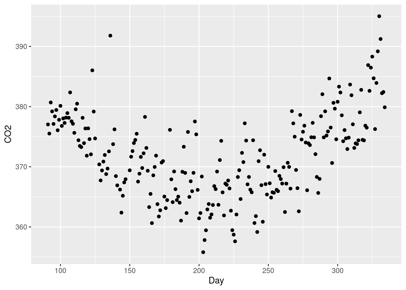
This U-shaped pattern is a good candidate for a polynomial regression model, which will include a \(Day^2\) coefficient. What makes a polynomial regression different from a “plain” transformation of the explanatory variable is that the model will include both the linear term \(Day\) and the quadratic term \(Day^2\).
As is often the case when programming, there are a variety of ways to accomplish this in R. One method is simply to add a new column to the data set holding the squared values of the Day variable (just as we did in Chapter 1 when centering the Honda Accord Mileage variable).
CO2Germany <- CO2Germany |>
  mutate(Day_squared = Day^2)
CO2Germany
Then we can use both the Day and Day_squared variables in our model formula. Combining these variables with the + sign operator yields the polynomial model from Example 3.13:
co2_poly_model <- lm(CO2 ~ Day + Day_squared, data= CO2Germany)
coef(co2_poly_model)
(Intercept) Day Day_squared
414.974746588 -0.476034264 0.001157719 We could also skip the “create a new variable in the data set” step, and square the day variable right in the model formula! But, it takes more adaptation to the model formula syntax than you might expect. Let’s see what happens if you try to use the ^ operator to square the Day variable inside the model formula:
co2_poly_model <- lm(CO2 ~ Day + Day^2, data = CO2Germany)
coef(co2_poly_model)
(Intercept) Day
368.39001392 0.01622773 Our model has two coefficients, not three? That’s not right - it seems that the whole term involving ^ is completely ignored! Well, as it turns out, the ^ isn’t ignored: it just has a different meaning than “square this number” inside a model formula4. If we want ^ to mean “square this number”, we can wrap the operation inside the I() function (short for “inhibit”):
co2_poly_model <- lm(CO2 ~ Day + I(Day^2), data= CO2Germany)
coef(co2_poly_model)
(Intercept) Day I(Day^2)
414.974746588 -0.476034264 0.001157719 The term label for this coefficient is a bit awkward this way, but the model is fit correctly! One advantage to doing the squaring directly in the model formula is that some R functions are able to detect the transformation, and use the appropriate methods to reverse or account for the transformation.
Warning
The extract_eq() doesn’t produce the correct equation describing this polynomial model, due to the I() in the term label.
extract_eq(co2_poly_model, use_coefs = TRUE, coef_digits = 5)\[ \operatorname{\widehat{CO2}} = 414.97475 - 0.47603(\operatorname{Day}) + 0.00116(\operatorname{Day\texttt{\^{}}2}) \]
Notice how the 2 isn’t properly superscripted, and the ^ is showing up in the equation? Luckily, it’s not too hard to remove the offending portion of the markup using the string substitution function gsub() before printing it:
poly_eq <- extract_eq(co2_poly_model, use_coefs = TRUE, coef_digits = 5)
gsub("\\texttt{^}2}", "}^2", poly_eq, fixed = TRUE)
\[ \operatorname{\widehat{CO2}} = 414.97475 - 0.47603(\operatorname{Day}) + 0.00116(\operatorname{Day}^2) \]
3.4.2.1 Visualizing a polynomial regression model
We can still visualize our model using the geom_smooth() function; all we need to do is include the quadratic transformation as part of the formula given to the formula argument:
ggplot(data = CO2Germany, mapping = aes(x = Day, y = CO2)) +
  geom_point() +
  geom_smooth(method = lm, formula = y ~ x + I(x^2), se=FALSE)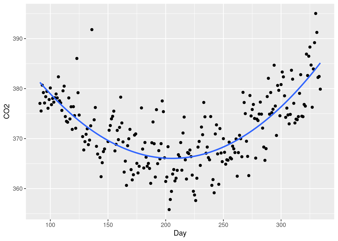
Not that when writing a model formula inside the geom_smooth() function, the formula is written with variables referring to plot aesthetics, not to referring to variables in the original data set!
3.4.3 Complete Second-Order Model
Example 3.14 introduces a “complete second order” model: one that uses two numeric explanatory variables, a quadratic transformation of both variables, and and interaction between these variables. In Example 3.14, these two numeric variables are the “drop height” and “funnel height” from an experiment seeking to find the combination of these variables that would maximize the amount of time a marble dropped into the funnel would spend circling the funnel before dropping through. These data are found the FunnelDrop data set:
library(Stat2Data)
data("FunnelDrop")
Since it’s not reasonable to test every combination of drop height and funnel height, modeling their relationship to the circling time is useful to help find a potential maximum that might occur at an untested combination. To obtain this “full second order” model, we’ll have to craft the right hand side our model formula carefully:
full_second_order_model<- lm(Time ~ Tube * Funnel + I(Funnel^2) + I(Tube^2),
                             data = FunnelDrop
                             )
broom::tidy(full_second_order_model)
the regression_plane() function can be used to visualize this model, provided the quadratic terms have been created inside the model formula using the I(x^2) method:
library(regplanely)
regression_plane(full_second_order_model)
3.5 Correlated Predictors
Example 3.15 introduces the HousesNY data set, which contains estimated prices (measured in thousands of dollars) for a sample of 53 city of Canton, NY, along with the size of each house (in 1,000s of square feet), the number of bedrooms, bathrooms, and the size of the lot (in acres).
library(Stat2Data)
data("HousesNY")
The predictive accuracy of a regression model estimating the price of a home improves with each attribute of the home added to the model as an explanatory variable. For example, the Price ~ Size + Beds produces a higher \(R^2\) value than either the Price ~ Size or Price ~ Beds models (though, adjusted \(R^2\) decreases):
Note that if you want to make a compact table of the summaries from multiple models like the one above, you can generalize the code below. It uses the broom::glance() function to create a table of model summaries (which includes the adjusted \(R^2\) value), and then uses purrr::map_df() to apply the broom::glance() function to each model in the list and assemble the results into a single table:
Code
price_beds <- lm(Price ~ Size, data = HousesNY)
price_size <- lm(Price ~ Beds, data = HousesNY)
price_size_beds <- lm(Price ~ Size + Beds, data = HousesNY)

all_models <- list(price_beds, price_size, price_size_beds)
model_formulas <- purrr::map_chr(all_models, \(x) deparse(x$call$formula))
names(all_models) <- model_formulas

purrr::map_df(all_models, broom::glance, .id = "model") |>
  dplyr::select(model, r.squared, adj.r.squared)
But, these models give very different impressions about the importance of the Price vs. Beds relationship
As we learn in Section 3.5, this change in the estimated magnitude of the Beds effect from one model to the next owes to multicollinearity: the explanatory variables in the Price ~ Size + Beds model are linearly related to one another!
Multicollinearity is not necessarily a bad thing; in general, the ability to estimate the effect of one variable after accounting for the other predictors in the mode is a feature of multiple regression. Using information about how the explanatory variables relate to one another makes this possible. But, there are limits to how reliably a regression model can estimate the effect of one variable after accounting for the other predictors when there are relationships between those explanatory variables. The stronger the relationship between explanatory variables, the more difficult it is to attribute changes in the outcome to one variable or the other
When multicollinearity exists between just two explanatory variables (such as the home size and number of bedrooms variables), constructing a scatter plot matrix of all the variables used in your model may reveal this relationship:
library(GGally)

HousesNY |>
  select(Price, Beds, Size) |>
  ggpairs()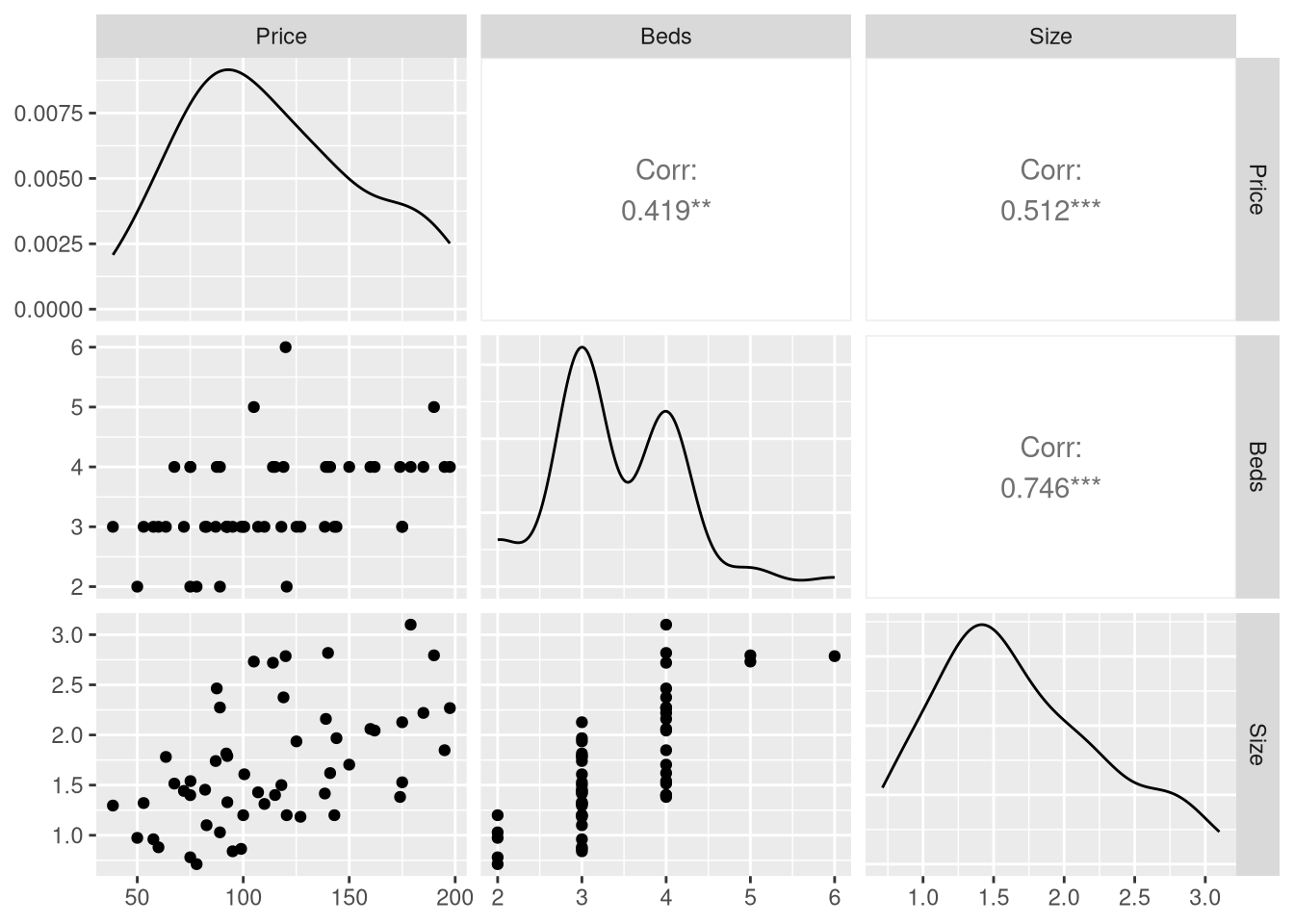
But when your model grows to include more than two explanatory variables, there may not be a strong relationship between any single pair of explanatory variable, but instead a strong relationship between one of your explanatory variables and a combination of multiple other explanatory variables. A scatter plot matrix won’t reveal this relationship to you, so it is better to rely on the Variance Inflation Factor statistic (VIF) as a robust method to detect multicollinearity.
The formula for the VIF statistic is fairly simple, but since it needs to be computed for every single explanatory variable in your model, it can be quite tedious to implement when models grow large. Instead, we’ll use the vif() function from the car package (Fox and Weisberg 2019).
Instead of of demonstrating how to compute the VIF using the CountyHealth data set (as done in Example 3.17), we’ll build another model using the HousesNY data set, but this time using all the remaining variables in the data as explanatory variable of the home price. Notice the handy shortcut . on the right hand side of the model formula, which R expands to mean “all other variables in the data set”:
price_all_variables <- lm(Price ~ ., data = HousesNY)

library(car)
vif(price_all_variables)
Beds Baths Size Lot
2.283420 1.223342 2.425255 1.058951 These VIF statistics are relatively low: a VIF of 5 is a cutoff for a “concerning” amount of multicollinearity between predictors, and 10 is cutoff for “very concerning” amount of multicollinearity between predictors. So, a VIF of at most 2.4 means we should consider our coefficient estimates in the model reliable.
3.6 Testing Subsets of Predictors
Section 3.6 introduces the Nested F-test as formal model comparison technique. The Nested F Statistic measures the amount of additional variability explained by adding one or more predictor to an existing more, and the F-test based on this statistic helps you decide if this additional variability explained is large enough for you to prefer this more complex model.
While the formula given for the Nested F statistic given in Section 3.6 is a bit complicated, there is good news: R makes it easy to perform a nested F-test without implementing the formula yourself! We’ve previously used the anova() function to perform F-tests on the individual sources of variable identified in a single model (i.e., F-test on the explanatory variables). But, when you supply several models to the anova function, it performs a Nested F-test comparing those models.
Consider this example based on the data from the HousesNY data set, that uses a nested F-test to compare two regression models:
price_size <- lm(Price ~ Size, data = HousesNY)
price_size_beds_lot <- lm(Price ~ Size + Beds + Lot, data = HousesNY)

anova(price_size, price_size_beds_lot)
The statistic given in the F column is the nested F-statistic, and the p-value helps you decide whether you should reject the null hypothesis that the \(\beta_{Beds} = \beta_{Lots} = 0\) in favor of the alternative that either \(\beta_{Beds} \ne 0\) or \(\beta_{lots} \ne 0\). Here, the large p-value gives us no reason to reject the null hypothesis, indicating we should favor the simpler Price ~ Size model.
You can provide the models in any order (the F-statistic and p-values won’t change), but ordering the models in ascending order of complexity (models with fewer predictors first, models with more predictors last) is preferred. That way, you won’t have negative sums of square and degrees of freedom, which can be a bit confusing:
anova(price_size, price_size_beds_lot)
anova(price_size_beds_lot, price_size)
If you provide 3 or more models, R will perform nested F-tests in pairs:
price_size <- lm(Price ~ Size, data = HousesNY)
price_size_beds_lot <- lm(Price ~ Size + Beds + Lot, data = HousesNY)
price_all_variables <- lm(Price ~ ., data = HousesNY)


anova(price_size, price_size_beds_lot, price_all_variables)
So the F-test in row 2 of the table compares model 2 (Price ~ Size + Beds + Lot) to model 1 (Price ~ Size), while the F-test in row 3 of the table compares model 3 (Price ~ Beds + Baths + Size + Lot) model 2 (Price ~ Size + Beds + Lot).
Warning
In some cases, supplying non-nested models to the anova() function will lead to a missing F statistic and p-value:
price_size <- lm(Price ~ Size, data = HousesNY)
price_beds_lot <- lm(Price ~ Beds + Lot, data = HousesNY)

anova(price_size, price_beds_lot)
This is a good thing - constructing an F-statistic and p-value from the sums of squares given by these two models makes no sense, because the smaller model’s explanatory variables are not a subset of the larger model’s explanatory variables. However, R will not always protect you from computing and F-statistic and p-value that make no sense:
price_beds <- lm(Price ~ Beds, data = HousesNY)
price_size_lot <- lm(Price ~ Size + Lot, data = HousesNY)
anova(price_beds, price_size_lot)
So exercise caution - don’t just throw models into anova() and look for p < .05! You must make sure that you’re comparing nested models, and R won’t check this for you!
Tidyverse aficionados will prefer the
expand_grid()function from thetidyrpackage, which performs the same task, but never converts strings to factors, does not add any additional attributes, and can expand any generalized vector, including data frames and lists.↩︎August 23, 2022↩︎
Remember of course, Age isn’t multiplied by “Male” or “Female”, age is multiplied by 1 or 0, because the Sex variable is wrapped in an indicator function when used in the model↩︎
To quote the help page for ?formula: “The ^ operator indicates crossing to the specified degree. For example (a+b+c)^2 is identical to (a+b+c)*(a+b+c) which in turn expands to a formula containing the main effects for a, b and c together with their second-order interactions.”↩︎