Chapter 2 uses the same simple linear regression model from Chapter 1 (the mode that uses mileage to explain the price of a used Honda Accord) as example to explain the logic of inferences based on Null Hypothesis Significance Tests (NHST) and the resulting p-values.
Luckily for us, we don’t have to learn many new tricks to execute the same hypothesis tests reported in Chapter 2, because the content of these tests were already present in the summaries we learned how to create in the previous chapter! However, we’ll reproduce those tables here, and point out where you can find the relevant statistics seen in Chapter 2 in the output seen from R.
2.1 Inference for Regression Slope
2.1.1 A t-test for the slope coefficient
Chapter 2.1 demonstrates that the t-statistic for the slope coefficient can be found by dividing the slope coefficient’s value by it’s estimated standard error. In this example, the t-statistic for the Mileage slope was shown to be -8.5. We can find the same standard error and t-statistic in the regression table produced by calling the summary() function on the fitted model object:
library(Stat2Data)data("AccordPrice")price_mileage_model <-lm(Price ~ Mileage, data = AccordPrice)summary(price_mileage_model)
Call:
lm(formula = Price ~ Mileage, data = AccordPrice)

Residuals:
    Min      1Q  Median      3Q     Max
-6.5984 -1.8169 -0.4148  1.4502  6.5655

Coefficients:
            Estimate Std. Error t value Pr(>|t|)
(Intercept)  20.8096     0.9529   21.84  < 2e-16 ***
Mileage      -0.1198     0.0141   -8.50 3.06e-09 ***
---
Signif. codes:  0 '***' 0.001 '**' 0.01 '*' 0.05 '.' 0.1 ' ' 1

Residual standard error: 3.085 on 28 degrees of freedom
Multiple R-squared:  0.7207,    Adjusted R-squared:  0.7107
F-statistic: 72.25 on 1 and 28 DF,  p-value: 3.055e-09
Looking in the “Coefficients” section of the out, The standard error values for the intercept and slope are found in the column labeled Std. Error, and the t-statistic values are found in the adjacent column labeled t value.
In the last column of this regression table are the p-values associated with each t-statistic. Since the p-values for the intercept and slope coefficient in this model very small numbers, R displays their value in scientific notation. You can tell R is using scientific notation by the presence of the lower case e in the value, followed by a negative integer.
For example, the p value shown for the Mileage slope’s t-statistic is 3.06e-09. This notation means “move the decimal place to the left by 9 places to find the precise value”. So 3.06e-09 in scientific notation translates to an actual p-value of 0.00000000306 - a very small number indeed! It’s easy to misread the p-values given in scientific notation as very large numbers instead of very small numbers if you are quickly glancing over the table, so be sure to read them carefully!
2.1.2 A Confidence Interval for the slope coefficient
One piece of information about the slope coefficient the is noticeably absent from the regression table is the 95% confidence interval. Example 2.1 demonstrates how to find the bounds of the 95% confidence interval by applying the formula:
\[
\beta_1 \pm t^* \cdot SE_{\beta_1}
\]
where \(t^*\) is the value of the 97.5th percentile of the \(t_{n-2}\) distribution. \(\beta_1\) and \(SE_{\beta_1}\) are easily found in the regression table, but finding the value of \(t^*\) will require one more computation. We can find this “critical value” by using the qt() function:
crit_t <-qt(p = .975, df=30-2)crit_t
[1] 2.048407
The p argument reflects the fact that we’re interested in the 97.5th percentile (expressed as the proportion .975, instead of a percentage). And, we need to supply the appropriate degrees of freedom for this t-distribution, which in this case is 28 (30 cars gives us 30 degrees to freedom to begin with, minus two for the intercept and slope coefficients estimated while fitting the model).
Now, we have the “ingredients” for our confidence interval formula:
Luckily, we don’t have to take the time and effort to implement this formula manually; there are several high-level ways to perform this computation more quickly (and with less rounding error!). The confint() function is one such method:
price_mileage_model <-lm(Price ~ Mileage, data = AccordPrice)confint(price_mileage_model)
The default setting for the confint() function is to produce a 95% confidence interval, but you can customize the confidence level by providing a different proportion as the level argument:
price_mileage_model <-lm(Price ~ Mileage, data = AccordPrice)confint(price_mileage_model, level = .99)
As useful as the confint() function is, it’s often a bit awkward to have your regression table separated from the confidence interval for your coefficient. A useful function that can produce the regression table including the confidence interval boundaries is the tidy function from the broom package(Robinson, Hayes, and Couch 2022)
This regression table has all the same information as the one produced by the summary(), just with slightly different names:
Correspondence between columns in the summary() regression table and the broom::tidy() regression table
broom::tidy() regression table
summary() regression table
term
row names
estimate
Estimate
std.error
Std. Error
statistic
t value
p.value
Pr(>|t|)
conf.low
No corresponding column
conf.high
No corresponding column
2.2 Partitioning Variability - ANOVA
Although the ANOVA table isn’t explained until Chapter 2, we already saw how to produce it for ourselves back in Chapter 1 using R’s anova() function.
However, there is one discrepancy between the output shown in the textbook, and R’s anova() function: R does not display an “SS Total” row in it’s ANOVA table. This is a minor loss, since the “SS Total” is of course, based on the sum of all the previous rows.
However, if you do need that row for some particular reason, it is easily reproduced with a little help from dplyr:
Once again, we don’t need to learn how to do any new computations to find the \(R^2\) value of a linear model: it’s already shown in the output from R’s summary() command:
summary(price_mileage_model)
Call:
lm(formula = Price ~ Mileage, data = AccordPrice)

Residuals:
    Min      1Q  Median      3Q     Max
-6.5984 -1.8169 -0.4148  1.4502  6.5655

Coefficients:
            Estimate Std. Error t value Pr(>|t|)
(Intercept)  20.8096     0.9529   21.84  < 2e-16 ***
Mileage      -0.1198     0.0141   -8.50 3.06e-09 ***
---
Signif. codes:  0 '***' 0.001 '**' 0.01 '*' 0.05 '.' 0.1 ' ' 1

Residual standard error: 3.085 on 28 degrees of freedom
Multiple R-squared:  0.7207,  Adjusted R-squared:  0.7107
F-statistic: 72.25 on 1 and 28 DF,  p-value: 3.055e-09
2.3.2 The Correlation Coefficient
The correlation coefficient between two variables can be computed using R’s cor() function, supplying either the outcome explanatory variable as the x argument, and the remaining argument as the y argument. Here, we use cor() as a summary function inside of dplyr’s summarize() function:
AccordPrice |>summarize(r =cor(x = Mileage, y = Price))
To perform a t-test on the correlation coefficient, you can use the cor.test() function. The syntax for using the cor.test() closely resembles the syntax for the lm() function, using a formula and a data argument. However, since the correlation coefficient is symmetric (and neither variable is considered the ‘outcome’ or ‘explanatory’ variable), both variables go on the right hand side of the tilde, separated by a +.
    Pearson's product-moment correlation

data:  Mileage and Price
t = -8.5002, df = 28, p-value = 3.055e-09
alternative hypothesis: true correlation is not equal to 0
95 percent confidence interval:
 -0.9259982 -0.7039888
sample estimates:
       cor
-0.8489441
2.4 Intervals for Predictions
In Section 2.4, two intervals around the regression line are introduced:
The confidence interval around the conditional mean of the outcome variable
The “prediction interval” around the conditional value of the outcome variable.
The formulas given for these intervals are similar to that for the confidence interval around the value of the slope coefficient, only with a more complex standard error estimator. There are several ways to compute these intervals in R without implementing the formula’s yourself; The “classic” way to compute these intervals to use the predict() function (which is included with base R). But, since our ultimate goal will be visualizing these intervals around our regression line, using the augment() function from the broom package will be a better choice in the long run.
As we learned when computing residual errors in Chapter 1, the augment() function uses the fitted model object to compute it’s predictions. But by default, the augment() function doesn’t compute any confidence or predictions intervals; To obtain these intervals, we’ll need to include the interval argument. For example, including interval="confidence" will instruct augment() to include the upper and lower boundaries of the 95% confidence interval around the predicted outcome value for each point in the original data set:
library(broom) # for the augment() functionlibrary(dplyr) # for the select() functionprice_mileage_model <-lm(Price ~ Mileage, data = AccordPrice)augment(price_mileage_model, interval="confidence")
The upper bound of the 95% confidence interval is in the .upper column, and the lower bound of the interval is in the .lower column. To obtain, say, a 99% confidence interval, we simply specify the confidence level as a proportion using the conf.level argument:
The agument() function isn’t limited to generating confidence and prediction intervals based on the Mileage values in the original data set - we can generate intervals for any Mileage values we choose! All we have to do is include a new data frame of Mileage values as the newdata argument to the augment() function:
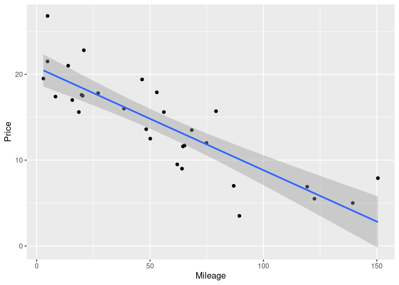
2.4.2 Visualizing Intervals Around a Regression Model
In Chapter 1, we learned how to visualize the predictions of a regression model using ggplot() and the geom_smooth() function specifically. In that example, we included the argument se = FALSE to suppress the confidence interval band around the regression line, since this interval had not been introduced yet.
This means that drawing the 95% confidence interval around your model’s predictions is as easy as removing se = FALSE from your code!
library(ggplot2)ggplot(data = AccordPrice,mapping =aes(x = Mileage, y = Price) ) +geom_point() +geom_smooth(method = lm, formula = y~x)
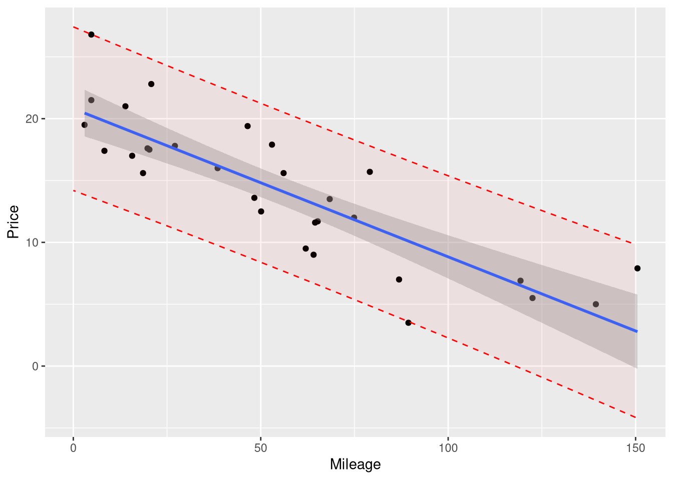
However, geom_smooth() doesn’t have to option to draw prediction intervals instead of confidence; so if you want one, you’ll have to plot it “manually”: by computing the boundary values yourself using augment() and drawing those values on the plot using geom_line() or geom_ribbon()
Since we want the boundaries of the prediction interval to appear as a smooth curve across the entire range of the plot, we’ll first need to compute the upper and lower boundaries of the interval across a fine grid of x-axis values. So, we’ll need to create a series of many closely space mileage values, ranging from the minimum and maximum mileage values in the original data, and supply them to the augment() function as the newdata argument.
Creating this series of closely spaced mileage values is the perfect job for the seq() function! Here, we’ll use it to create a sequence of Mileage values spaced out by .1 miles, starting at 0 and ending at 150:
new_mileages <-data.frame(Mileage =seq(from =0, to =150, by = .1))
Then, we’ll give these new Mileage values to the agument() function, and ask for boundaries of the 95% prediction interval around each of these nrow(new_mileages) Mileage values:
Now, we’re ready to plot! Here, we demonstrate two ways of adding this interval to the plot. First, we’ll draw the boundaries of this interval as two separate dashed lines:
Note that we had to supply the prediction_interval data frame as a layer-specific data frame for the geom_line() function.
If you prefer the “filled in” style of interval (like how the confidence interval appears from geom_smooth()), you can use geom_ribbon() to plot the interval:
Take note of a few important things about this version of the prediction interval:
We drew it before drawing the confidence interval and the regression line, so the shading of the confidence interval would not be affected by the shading of the prediction interval.
The names of the y, ymax and ymin aesthetic matched the names of the columns in the prediction_interval data set
We set the alpha argument to a very small number, in order to make the interval transparent, and avoid obscuring the data points. We recommend that you use an alpha value between .02 and .1 for your plots.