2018-05-04

The Grammar of Graphics

We're going to continue the tour of the ggplot2 package we began last week

We'll explore some more "advanced" features of the package, look at data management issues in the context of ggplot-ing, and make some common types of visualizations.

NB: This lab was made using ggplot2 version 2.2.1, and a few things I'll be using are specific to ggplot2 version >= 2.0. So, if you have an older version installed, you'll need to upgrade to follow along. You can check your version using the command packageVersion("ggplot2")

The iris dataset

We'll begin our examples with the iris dataset, which gives measurements of the length and width (in cm.) of the sepals and petals from 3 species of irises (setosa, versicolor, and virginica).

The iris dataset

Lets take a glimpse at the data itself.

Sepal.Length Sepal.Width Petal.Length Petal.Width Species
5.1 3.5 1.4 0.2 setosa
4.9 3 1.4 0.2 setosa
4.7 3.2 1.3 0.2 setosa
4.6 3.1 1.5 0.2 setosa
5 3.6 1.4 0.2 setosa
5.4 3.9 1.7 0.4 setosa

The iris dataset

Let's warm up by making a scatter plot of Sepal width against the Sepal length for the 3 different species. We'll save the plot as an object, so we can build on it in later slides.

library(ggplot2)
p <- ggplot(data = iris, 
        mapping = aes(x = Sepal.Length, y = Sepal.Width, color = Species)) +
  geom_point()
print(p)

Adding smooths

ggplot has a special geometric object called a "smooth", which is a line path whose x and y values are determined by a regression algorithm (e.g., loess, or lm).

We can show a regression line and conditional mean C.I. for each flower group by adding a geom_smooth layer to the plot, and setting the method argument to be "lm".

p + geom_smooth(method = "lm", fullrange = TRUE)

Layer-specific data and mappings

So far, any geometric object layers we've added have inherited their data and aesthetic mapping from the "global" mapping defined in the call to the gpplot function.

However, that need not be the case: geoms can set their own layer-specific data sets and aesthetic mappings. The layer-specific dataset or mapping is set inside the call the geom_*whatever*, using the same syntax as inside ggplot.

This feature is most useful for visualizing data from two different observational units (e.g., data from individual subjects, and summary statistics for each experimental condition).

To see how to do this, let's show the average Sepal width and length for each Iris species on our plot of the raw observations.

Layer-specific data

To do this, we'll need to a data frame that summarizes the Sepal length and width for each species with their average size.

We'll start creating this data frame by grouping the iris dataset by the Species variable and averaging all the remaining columns.

library(dplyr)
iris_means <- iris %>% group_by(Species) %>% summarise_all("mean")
pander(as.data.frame(iris_means), split.table = Inf)
Species Sepal.Length Sepal.Width Petal.Length Petal.Width
setosa 5.006 3.428 1.462 0.246
versicolor 5.936 2.77 4.26 1.326
virginica 6.588 2.974 5.552 2.026

Layer-specific data

Now, we'll include another layer of points, and use the summarized dataset as its source of information. We'll also use a different shape (an X), size, and thickness, so we can distinguish the means from the raw data.

p + geom_point(data = iris_means, size = 4, shape = 4, stroke = 2)

Adding Petal Width and Length

So far we've only been looking at half the data, so lets add in the Petal length and width measurements.

But there is a problem: the widths and lengths for Petals and Sepals are separate variables!

Sepal.Length Sepal.Width Petal.Length Petal.Width Species
5.1 3.5 1.4 0.2 setosa
4.9 3 1.4 0.2 setosa

This means we can't easily add a new aesthetic mapping to distinguish Sepal measurements from Petal measurements, because there is no single variable in the data set which identifies Sepal measurements from Petal measurements.

The iris dataset

We'll need to reshape the data, so that one variable in the data set identifies Sepal measurements from Petal measurements in the Length and Width variables.

library(tidyr)

# Add a primary key
iris_long <- mutate(iris, FlowerID = 1:nrow(iris)) %>%
  # change layout to long-form
  gather(key = variable, value = size, Sepal.Length:Petal.Width) %>%
  # Break "Sepal/Petal" & "Length/Width" into 2 columns
  separate(variable, c("Structure", "dimension"))

# Make a separate variable for length and width measurement
iris_normal <- spread(iris_long, dimension, size)

The new iris_normal dataset

Ah, much better

Species FlowerID Structure Length Width
setosa 1 Petal 1.4 0.2
setosa 1 Sepal 5.1 3.5
setosa 2 Petal 1.4 0.2
setosa 2 Sepal 4.9 3
setosa 3 Petal 1.3 0.2
setosa 3 Sepal 4.7 3.2
setosa 4 Petal 1.5 0.2

Plotting Petal and Sepal measurements

Since the plot of just the Sepal measurements was already pretty "full", I think the best way to add in the Petal measurements is to put the Sepal measurements and the Petal measurements into two different panels.

Panel's are called facets in the "grammar of graphics", and are functionally similar to dividing the plot window up into a "matrix" of different plots in base R plotting with par(mfrow = c(x,y)).

Facets are added to the plot with the facet_grid() function (for when the number of facets could evenly fill a matrix) or the facet_wrap() function (for the more general case when the number of facets does not evenly fill a matrix)

Facetting

Facets are added just like adding a new geom layer, and the layout of the panels is determined using formula syntax.

Here, we're asking for that dataset to be divided into different panels according to the values of the Structure variable.

Variables on the left side of the ~ map onto vertically arranged panels, and variable names on the right side map onto horizontally arranged panels.

p <- ggplot(data = iris_normal, 
        mapping = aes(x = Length, y = Width, color = Species)) +
  geom_point()
p + facet_grid( ~ Structure)

We'll show the plot on the next slide…

Facetting

p <- ggplot(data = iris_normal, 
        mapping = aes(x = Length, y = Width, color = Species)) +
  geom_point()
p + facet_grid( ~ Structure)

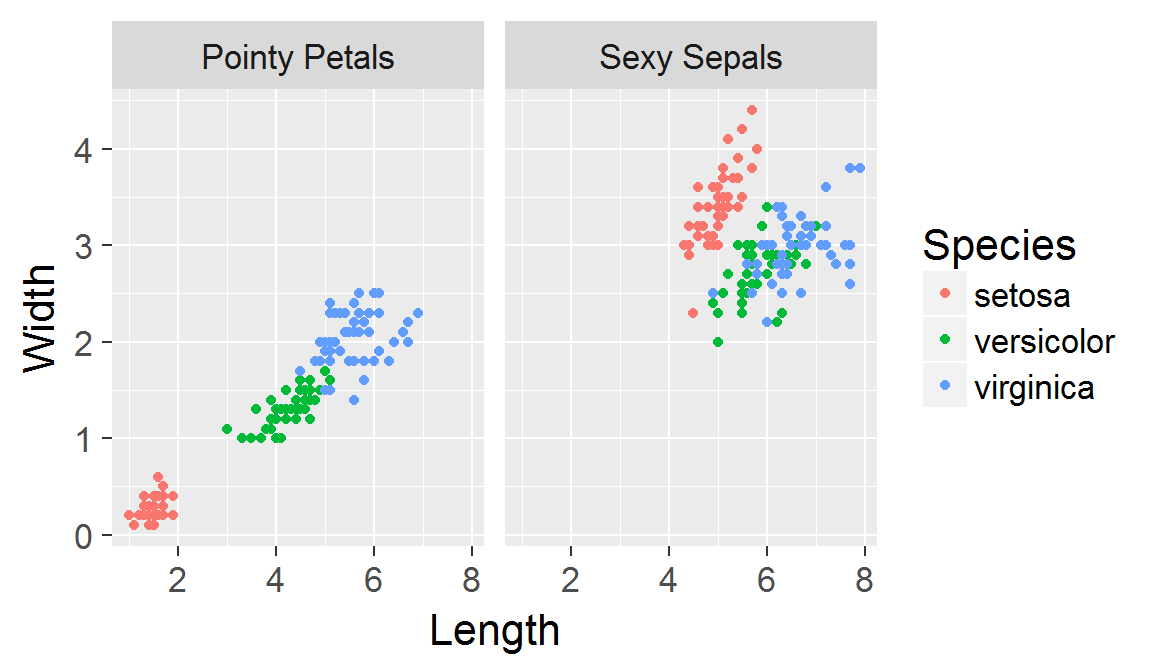
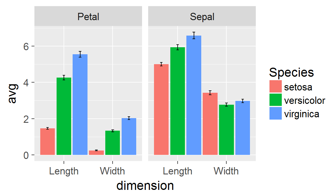
Panels created with faceting share the same scales!

Facet Labels

If you want to change the panel labels, you'll need to use whats called a labeller function. The easiest way to create a labeller function is by the calling the function called labeller on a named character vector.

The names of the elements in the character vector should be values of the variable you are faceting by, and the elements themselves should be the labels you want to appear in the plot.

For the Structure variable, this would look something like:

labeller(Structure = c("Petal" = "Pointy Petals",
                       "Sepal" = "Sexy Sepals")
         )

Facet Labels

Then take this function and supply it as the labeller argument of facet_grid or facet_wrap.

p + facet_grid(~ Structure,
               labeller = labeller(Structure = c("Petal" = "Pointy Petals",
                                                 "Sepal" = "Sexy Sepals")))

Plots with error bars

Lets switch from scatter-plotting the lengths and widths to plotting some summary statistics of the Petal/Sepal lengths and widths for each species.

Of course, any good plot of summary statistics includes error bars. Luckily, ggplot makes it easy to add error bars, with the geom_errorbar function.

Step 1: Summarizing the long-form dataset, including the upper and lower bounds of the 95% CI.

iris_means <- iris_long %>%
  group_by(Species, Structure, dimension) %>%
  summarise(avg = mean(size), SD = sd(size), N = n()) %>%
  mutate(SEM = SD/sqrt(N),
         upper = avg + SEM*qt(.975, N-1,lower.tail = F),
         lower = avg - (upper-avg))

Petal/Sepal Averages

Species Structure dimension avg SD N SEM upper lower
setosa Petal Length 1.462 0.1737 50 0.02456 1.413 1.511
setosa Petal Width 0.246 0.1054 50 0.0149 0.216 0.276
setosa Sepal Length 5.006 0.3525 50 0.04985 4.906 5.106
setosa Sepal Width 3.428 0.3791 50 0.05361 3.32 3.536
versicolor Petal Length 4.26 0.4699 50 0.06646 4.126 4.394
versicolor Petal Width 1.326 0.1978 50 0.02797 1.27 1.382
versicolor Sepal Length 5.936 0.5162 50 0.073 5.789 6.083
versicolor Sepal Width 2.77 0.3138 50 0.04438 2.681 2.859
virginica Petal Length 5.552 0.5519 50 0.07805 5.395 5.709
virginica Petal Width 2.026 0.2747 50 0.03884 1.948 2.104
virginica Sepal Length 6.588 0.6359 50 0.08993 6.407 6.769
virginica Sepal Width 2.974 0.3225 50 0.04561 2.882 3.066

Plotting the averages

This time, let's put the type of structure measured on the x-axis (i.e., map the dimension variable to the x aesthetic).

p <- ggplot(iris_means, aes(x = dimension, y = avg, color = Species)) +
  geom_point() + facet_grid(~Structure)
print(p)

Adding the confidence intervals

To add error bars for the confidence intervals, all we need to do is add a new layer containing them with geom_errorbar.

The 2 important aesthetics for the error bar geoms are ymin and ymax, which should be mapped to the lower and upper variables, respectively.

p + geom_errorbar(aes(ymin = lower, ymax = upper), width = .15)

A barplot of the averages

You could also plot these averages with a barplot, which can be created with geom_col. Making a bar plot requires a little tweaking:

  • The color aesthetic of bars corresponds to the color of the bar's perimeter, rather than the color of its area, so we need to map the Species variable to the fill aesthetic instead
  • To get side-by-side bars (instead of stacked bars), we need tell ggplot to spread each bar out across the x axis the position_dodge() function. This function takes 1 argument (width), which controls how far apart the bars are placed

A barplot of the averages

Here's how we apply those tweaks to get a bar plot of the averages

p <- ggplot(iris_means, aes(x = dimension, y = avg, fill = Species)) + 
  geom_col(position = position_dodge(width = 1)) + 
  facet_grid(~Structure)
print(p)

A barplot with errror bars

To include error bars, we use geom_errorbar like before, but we also must set position_dodge(width = 1) to get each error bar to match up correctly.

p + geom_errorbar(aes(ymin = lower, ymax = upper),
                  position = position_dodge(width = 1),
                  width = .15)

Miscellaneous

There is still a lot more to ggplot (the author of the package has a great book) but here are a few more pointers.

  • You'll often need to change the name and limits of a scale. You can do this by invoking the appropriate scale_*whatever* function, and using the scale_name and limits arguments
    • E.g., scale_y_continuous(scale_name = "Petal Width", limits = c(0,15))
  • Things like font, font size, background color, aspect ratio, etc., are controlled using the theme function.
    • The theme function is quite extensive, so see this list and ?theme for a description of all its arguments and options.
    • ggplot2 includes several pre-made themes (e.g., use p + theme_bw() for black and white, or p + theme_dark())

Activity

The esoph dataset reports the number of patients who did and did not develop esophageal cancer given three observational variables: age, alcohol consumption, and tobacco consumption (see ?esoph for more info).

First, create 3 new variables using the code below.

  • p: The probability of getting cancer
  • upper: The upper bound of cancers (assuming a binomial distribution)
  • lower: The lower bound of cancers (assuming a binomial distribution)
esoph <- mutate(esoph,
                cell_size = ncontrols + ncases,
                p = ncases/cell_size,
                upper = qbinom(.975, size = cell_size, prob = p) / cell_size,
                lower = qbinom(.025, size = cell_size, prob = p) / cell_size,
                cell_size = NULL)

Activity

Plot the probability of cancer for each group, along with errors bars, using

  1. A barplot
  2. A dot-plot

Remember to take advantage of facets, including facet_grid or facet_wrap.