2018-05-04

The Grammar of Graphics

The ggplot2 package provides a library of plotting and graphics tools that implements the "Grammar of Graphics" (Wilkison, 2005; Wilkinson, Anand, & Grossman, 2005).

Wilkinson's "Grammar of Graphics" is both a technical description of the structures used to produce quantitative visualizations, as well as a new language to describe the visual features of quantitative visualizations. In many ways, it formalizes what you intuitively know about plots and graphs already, but had no "lemma" for.

Realizing that ggplot2 implements a new "grammar" than you've used previously helps facilitate adopting a different mindset than you've used previously, which in turn helps produce more effective visualizations, more quickly.

The Grammar of Graphics

The ggplot system of plotting distinguishes between three main sets of features that all visualizations posses.

  • Aesthetics
    • The "low level" features of the data shown in a plot
  • Geoms
    • The geometric objects used to instantiate the data visually
  • Scales
    • The aspects of a plot that allow you to measure the aesthetics

Aesthetics

Aesthetics are the "simple" features possessed by data when they are displayed visually

  • The color of a datum is one of its aesthetics
  • The x position of a datum is one of its aesthetics
  • The y position of a datum is one of its aesthetics
  • The size of a datum is one of its aesthetics
  • The shape of a datum is one of its aesthetics

In any visualization, aesthetics may or may not be used to carry information

  • E.g., the color of each datum may be the same, or colors may differ in order to convey that there are different groups of data.

Geoms

Geoms are the geometric objects chosen to instantiate the data visually, like points, lines, bars, or text.

Choosing the right geom can bring clarity to your visualization

  • The same observations could be visualized with circles, or lines, or rectangular bars, or with all 3!

Importantly, different geoms have different aesthetics

  • A bar can't have a shape aesthetic (it's already a rectangle), but it can take on different border colors, different fill colors, and different positions
  • A line can't have a shape aesthetic (it's a line) or a fill aesthetic (it's 1D, you can't fill it), but it can have different types (dotted, dashed, etc) and line colors.

Scales

Scales are the features of a plot that allow you to measure the aesthetics (i.e., map them back from colors and shapes to the variable and values of the dataset)

  • The ticks and labels on the x axis might allow you to match axis position with a specific timepoint
  • The colors and labels in a legend allow you to match colors to a specific group

Importantly, the general term "scales" is chosen over the more common term "legend" because these features of the plot are used to measure and map many different aesthetics, discrete or continuous.

ggplot is data-driven plotting

The ggplot tool set is specifically oriented around creating a plot from your dataset, rather than from individual vectors.

In my view, this is the better conceptual model to have: all plots begin with data, and data are never a set of values without a context.

This is the main reason we choose data frames as the structure to hold our data in R. Data frames allows us to efficiently organize our data by the unique observations we've made, and each variable we've made observations of.

So the main aim of the ggplot tool set is to take the relational structure you've already defined in your data frame and translate it into a visualization via aesthetic mappings.

Mapping variables to aesthetics

Making a plot with ggplot2 always begins with a call to the ggplot function, which takes 2 arguments:

  • data: The name of the data frame which holds the information you'd like to plot
  • mapping: The list of aesthetic mappings to use for the plot

Mapping variables to aesthetics

The mapping argument requires a special list of values created by the function aes. The aes function constructs this list when you provide it special key/value pairs

  • The "keys" are unquoted names of plot aesthetics (x, y, color, shape, linetype, etc.)
  • The "values" are unquoted names of variables (i.e., column names) in your data frame

Getting Started

It's time to start getting into some code! For our examples, we'll use the built-in Orange dataset, which contains measurements of trunk circumference (measured in mm.) over time (measured in days) from 5 orange trees.

Tree age circumference
1 118 30
1 484 58
1 664 87
1 1004 115
2 118 33
2 484 69
2 664 111

A First Plot

Lets think about how best to visualize these circumferences.

These measurements are taken over time, and it's usually best to represent time on the x-axis, so we'll map the age variable to the x aesthetic.

The dependent measure should almost always be represented along the y-axis, so we'll map the circumference variable to the y aesthetic.

There are measurements from 5 different trees, so we ought to represent the different trees visually in some way. Many possibilities exist, but let's try representing each tree with a different color, by mapping the Tree variable to the color aesthetic.

library(ggplot2)
ggplot(data = Orange,
       mapping = aes(x = age, y = circumference, color = Tree))

A First (Blank) Plot

ggplot(data = Orange,
       mapping = aes(x = age, y = circumference, color = Tree))

Where's the beef data? Our plot is blank because we didn't add any geometric objects to represent the data!

Adding layers to the plot

To add a geom object to represent the data, we need to add a new "layer" containing those geom objects to the plot.

We do this, we need two things: we need a function to create the geometric object layer, and function to add it to the plot.

As pointed out earlier, ggplot supports creating many different geometric objects, and there is a different function to create the layer for each one.

The names of the these functions follow a common pattern: geom_, followed by the name of the geometric object.

  • geom_point, geom_line, geom_bar, geom_boxplot, etc.

Adding layers to the plot

Lets use points to instantiate our data on the plot, via the geom_points() function, and then add the layer of points to our blank plot with the + operator.

ggplot(data = Orange,
       mapping = aes(x = age, y = circumference, color = Tree)) + 
  geom_point()

Scales are free!

Because we mapped the Tree variable to the color aesthetic, we get a different color point for each tree. Additionally, a legend is automatically drawn.

ggplot(data = Orange,
       mapping = aes(x = age, y = circumference, color = Tree)) + 
  geom_point()

ggplots are first-class

Note that we do not necessarily have to create the entire plot at once. ggplots can be saved as R objects, instead of being drawn in the plot window, simply by using the assignment operator.

plot_obj <- ggplot(data = Orange,
               mapping = aes(x = age, y = circumference, color = Tree))
plot_obj + geom_point() # now we see our plot

Changing geoms

Let's also connect the points for each tree, using geom_line, so a viewer can easily chart the course of a single tree's growth.

ggplot(data = Orange,
       mapping = aes(x = age, y = circumference, color = Tree)) + 
  geom_point() + 
  geom_line()

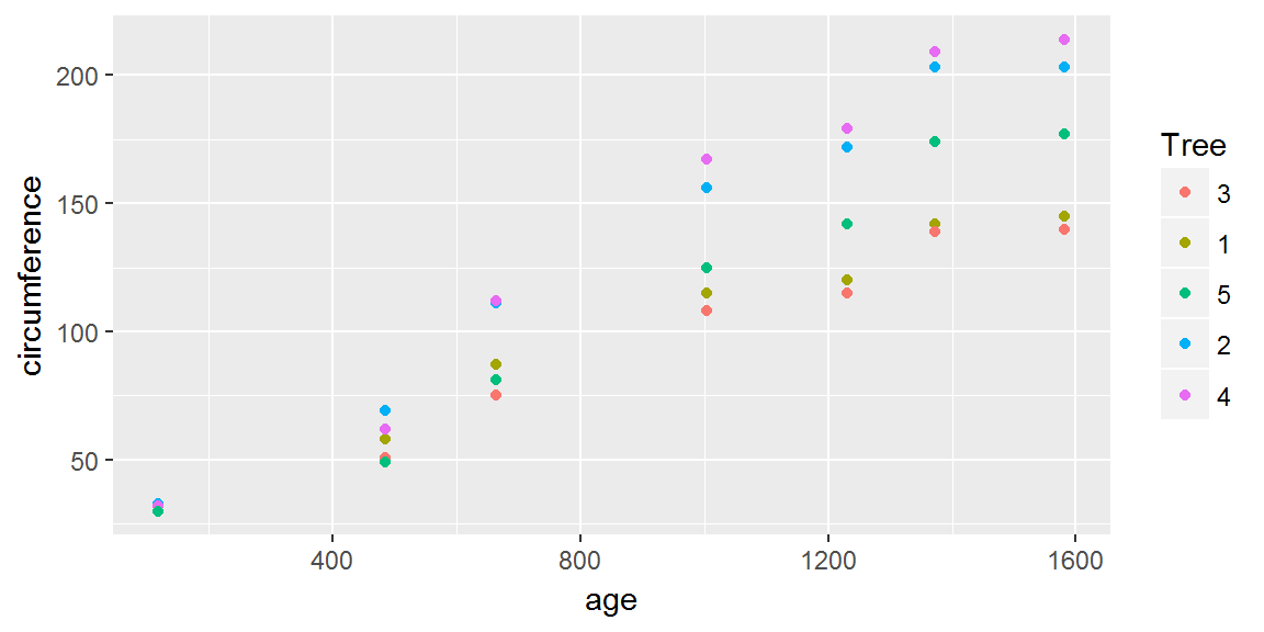
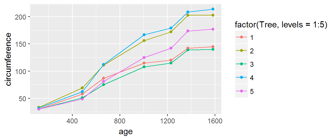
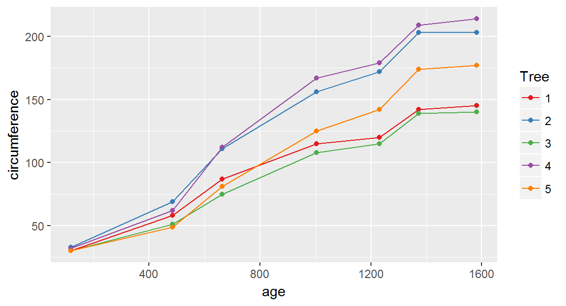
Notice how the color scale automatically shows both lines and points now!
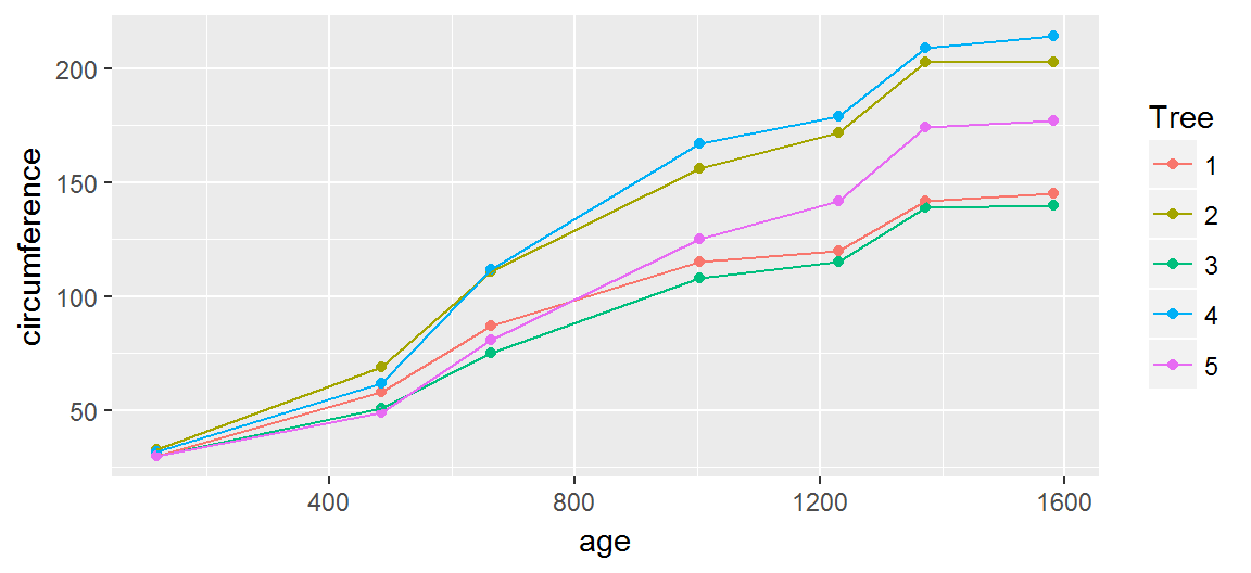
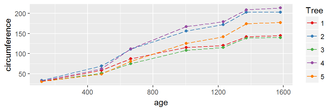
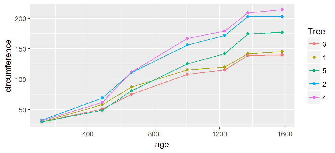
Adjusting the scale

One annoyance is that the scale seems to sorts the trees in random order. As it turns out, there is a method to this madness.

The Tree variable is an ordered factor, and the factor levels are arranged in that specific order.

str(Orange$Tree)
##  Ord.factor w/ 5 levels "3"<"1"<"5"<"2"<..: 2 2 2 2 2 2 2 4 4 4 ...

As mentioned previously, ggplot is oriented around the characteristics of your data set, and if a variable is an ordered factor, then ggplot respects that ordering when it creates its scales.

Adjusting the scale

Lets change the variable to be a regular, un-ordered factor. We can use R functions on variables inside aes just as if they were normal objects.

Here, factor just changes the ordering of the factor levels, without relabeling the data from each tree.

ggplot(data = Orange,
       mapping = aes(x = age, y = circumference,
                     color = factor(Tree, levels = 1:5))) + 
  geom_point() +  geom_line()

Adjusting the scale

However, we need not modify the dataset itself to achieve the desired result: we can manipulate the scale itself with some functions provided by ggplot.

The functions for manipulating the scales have a consistent naming scheme:

  1. scale_
  2. The name of the measured aesthetic
    • e.g., color, x, y, size, etc.
  3. The type of variable the aesthetic represents
    • e.g,. continuous, discrete, identity, etc.

Here, we'll use the scale_color_discrete function to modify our scale, because we've mapped each tree to a distinct color.

Adjusting the scale

The limits argument sets the range of the scale, as well as the default order of the displayed labels.

ggplot(data = Orange,
       mapping = aes(x = age, y = circumference, color = Tree)) + 
  geom_point() +geom_line() + 
  scale_color_discrete(limits = as.character(1:5))

Adjusting the colors

You can exactly specify which colors to use using their color names (see ?colors) or Hexadecimal RGB values and scale_color_manual.

ggplot(data = Orange,
       mapping = aes(x = age, y = circumference, color = Tree)) + 
  geom_point() + geom_line() + 
  scale_color_manual(values = c("black","cornflowerblue", "brown1",
                                "darkgreen", "deeppink"),
                     limits = as.character(1:5))

Adjusting the colors

If you have the RColorBrewer package, you can use the color palettes it provides via the scale_color_brewer() function.

RColorBrewer::display.brewer.all()

Adjusting the colors

Let's use the "Set1" pallete for our colors by specifying the palette argument to scale_color_brewer

ggplot(data = Orange,
       mapping = aes(x = age, y = circumference, color = Tree)) + 
  geom_point() + geom_line() + 
  scale_color_brewer(palette = "Set1", limits = as.character(1:5))

Adjusting the colors

There are many custom-made pallets to choose from, if you're willing to go looking for them. For example, one of my favorite sets of palletes are the Wes Anderson Color Palletes, which I encourage you to check out.


Setting an aesthetic

We can also set the aesthetics for our data to a constant property (i.e., not have the aesthetic change across levels of a variable).

For example, we can change what type of line is drawn by setting the linetype aesthetic to constant value outside the aes function and inside the geom_line() function.

ggplot(data = Orange,
       mapping = aes(x = age, y = circumference, color = Tree)) + 
  geom_point() + geom_line(linetype = "longdash") + 
  scale_color_brewer(palette = "Set1", limits = as.character(1:5))

Activity

The Indometh dataset has pharmacokinetics measurements (i.e., excretion/absorption of a drug) of the NSAID pain-killer indometacin.

6 subjects were administered a dose of indometacin, and their blood concentration levels were measured 11 times afterwards (see ?Indometh for more info).

Use ggplot to visualize the data collected from each subject. Be sure to

  1. Distinguish between the data from each subject
  2. Arrange the scale identifying the data from each subject in ascending order.
  3. Experiment with using points, lines, points and lines, with different sizes of each, to see which looks best.